What is a post template?
The post template determines what layout your post will have (on different devices). This way you don’t have to format each post from scratch, but just type the text, and the template will take care of most of the formatting.
Thanks to Elementor Pro you don’t need to know php, and you can create such a template yourself, easily.
Custom templates allow you to use different layouts for different types of posts (based on section or author, for example), allowing you to differentiate different content in interesting ways.
So if you’re an architecture studio, for example, you might have different templates for a blog post, a case study, a media mention, or a 3D model presentation.
There are no limits to the imagination.
A great advantage is the so-called dynamic blocks, which allow content to be written dynamically to the template based on the post.
For example, the template knows to take the thumbnail image chosen for the post and display it in the top – hero section, or to take the post title and display it in large font as the post title on the page.
This can make each post look unique, even if you use the same template.
How do I create a template in Elementor Pro specifically?
First click on Templates > Create Template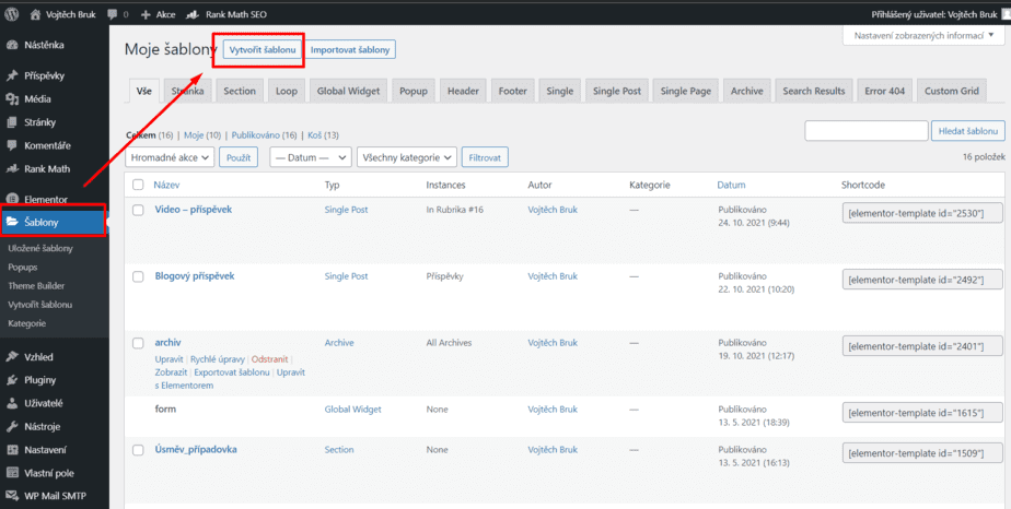
> then select the template type (always “Single Post” for posts) and name your template something.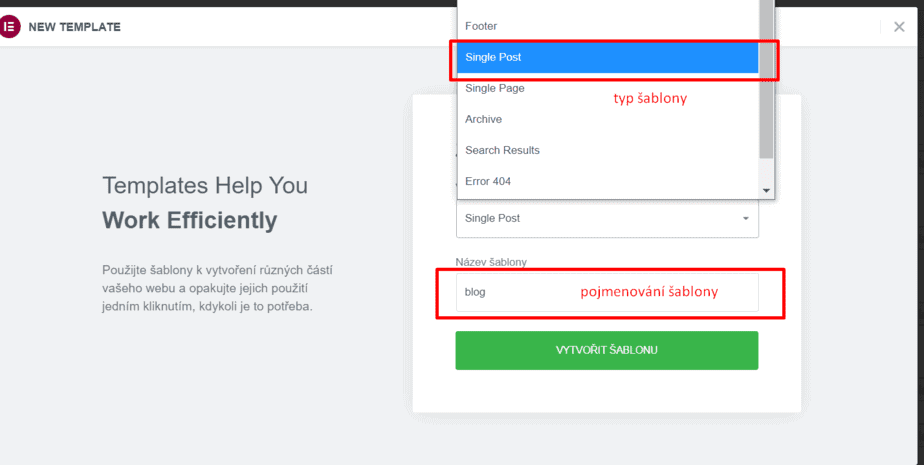
Next, close the library option (unless you want to import any pre-made Elementor template, which from my experience I rather recommend not to do). And you can start creating.
Background
After clicking on the cog in the bottom left corner, you can select a specific post under “Preview Settings” as the filler content to display when you build it in the template.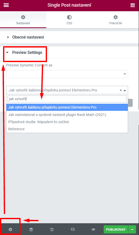
In the widgets/”content tiles” menu, you can recognize the dynamic ones by looking under the “Single” menu and seeing them right at the top of the menu.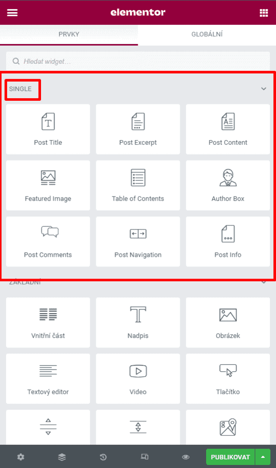
Think about the fact that these single widgets will look different for each post. So don’t be fooled by the fact that when you build the template, their appearance will be determined by the filler content you selected at the beginning.
If you want some inspiration when building, you can check out the video I created here.
Verifying Responsiveness
Once you’re happy with your template, I highly recommend making sure everything still looks as it should on your phone and tablet. You do this by clicking on the device minicon on the bar in the bottom left corner and then selecting the device.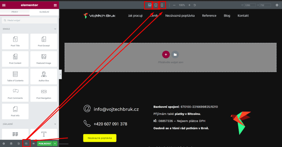
If something doesn’t fit you have three options to fix it 1) Play around with the font size 2) Play around with the size and width of the columns on different devices 3) Decide not to display a certain element on a particular device at all.
The first two options are responsive by default, and such a setting change should not affect how your content looks on desktop.
The third option can be found in the advanced settings of that widget under the responsive option.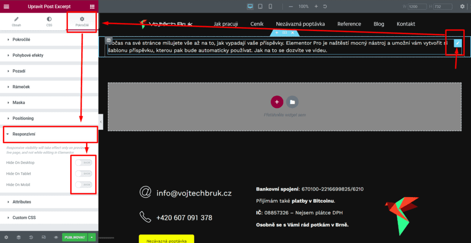
Condition Settings
Once you are happy with your template, click publish and set the conditions where you want the template to apply. Elementor should prompt you to set the conditions itself.
If you set: Posts > All template will be applied to all posts.
If you set (beware of slightly confusing translation): In Rubric > [specific rubric], the template will be applied to posts in that rubric etc.
Functionality check
Finally, make sure that the template is actually being used where it should be.
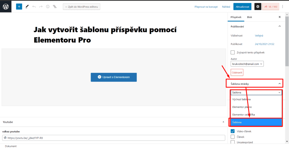
If by chance this is not the case, make sure you have the Page Template in WordPress (or even Elementor) set as “Template”, otherwise the template will not be applied despite the conditions! Warning!
I hope the video and the article were useful and I would be very happy if you could share what template you managed to create with Elementor!, also feel free to get in touch if you don’t know anything, I’ll be happy to help you!
For your success,
Vojta


