You can find a contact page on almost every website. Often people take it automatically and don’t put much work into it. Yet the contact page is often the key. It decides whether customers contact you or not. It decides whether your site works or not.
Let’s take a look at 4 tips to get the most out of your contact page.
1. The page should have personality
It should give the impression that it was made by people and for people. This is elaborated more by Sabina Idler in her article. But it comes down to simple logic – if people feel comfortable and welcome, the chances of you being approached increase.
It’s important to anticipate the problems and doubts people might have on the contact page and minimize their likelihood. Also, don’t be afraid to keep a friendly and welcoming tonality, just like on the rest of the site.Just because a page is called “contact” doesn’t mean it should be purely dry and informative.
2. The page should be simple
- no unnecessary text
- different contact options in groups near each other (phones, emails, stores..)
- visual separation – the visual distinction makes it obvious at a glance that the page has different parts and each part contains something different
The important thing, however, is simplicity > completeness. If possible, don’t overwhelm people with excessive contact options. Offer an “irreducible number” of options. You want to meet a wide demand while keeping the number of options to a minimum.
You can feel free to refer the contact to a specific location later.
3. Page minimizes friction for CTA (call to action)
A CTA can be sending a form, calling a number, writing an email. Simply “contact” as such. A good site will minimize its complexity.
In addition to visual separation and a reasonable amount of options, you can also achieve this with HTML optimization of the contact information itself, clever form composition, or experimental CTAs.
HTML optimization
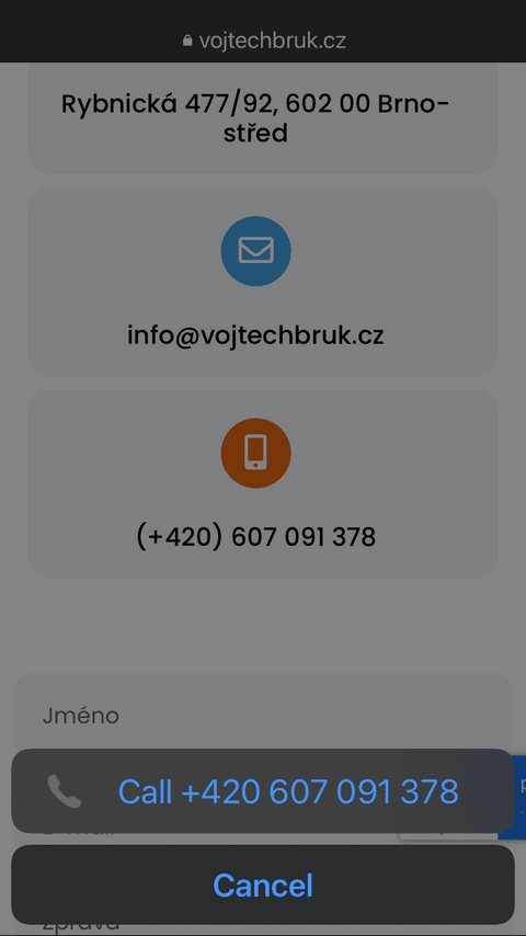
All phones on the page should have the tel: html attribute ****
<a href="tel:607091378">607091378</a>
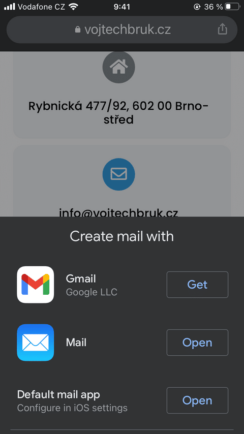
all emails then mailto: attribute
<a href="mailto: in**@*********uk.cz">in**@*********uk.cz</a>
That way, when people click on a number or email, they are immediately offered the option to call/write you. Which, especially on the phone, is very useful.


Minimalist Form
The more form-filling you ask people to do within a form, the fewer forms you get people to fill out. In other words, each additional entry reduces the % of users who submit the form.
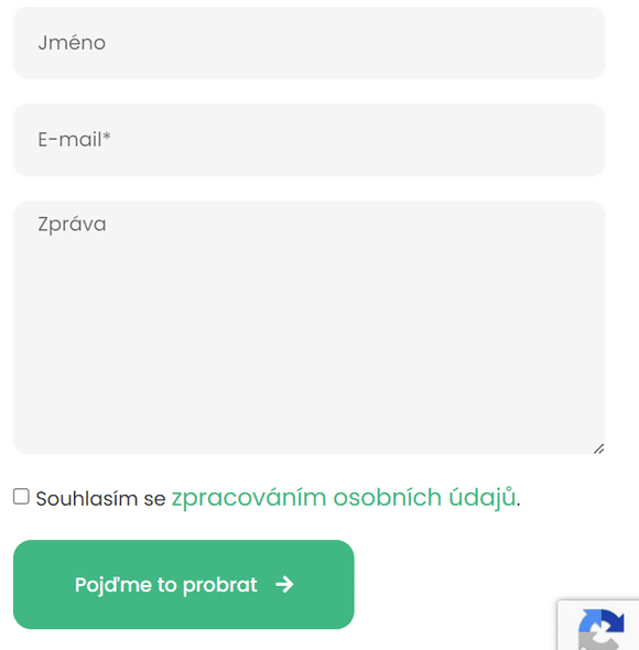
So for now, I keep the form on my site pretty simple:

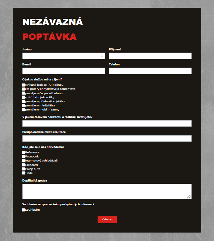
On the other hand, multiple items can also work as a good filter. So, when I was making a website for a construction company, we decided to put more items in the form, as it is better for the company to have a smaller number of quality inquiries than a number of people who don’t really “know what they want.”

Again, for any form, you should strive for irreducible simplicity.
However, if your goal is to get “as many contacts/leads as possible” from the site and you’re not interested in filtering them, fewer items is probably a better way to go.
Experimental CTA
For example, London SEO company ClickSlice doesn’t have a form. It doesn’t even have a contact page. It has one rudimentary CTA – schedule a call with us. And it has an entire site built around that.

While it seems like a different principle, it’s still the same thing – minimizing friction to get people to contact you. And sometimes minimizing friction on the contact page can… not have that page at all.So you might want to think about whether you could minimize friction on your site in a similar way.
3. The page explains and is trustworthy
This can also be called “psychological optimization”
- The page explains why someone should contact you
- The page promises to solve people’s problems
- The page promises that people will not lose anything by contacting you, at most they will gain
A separate article could be written about this topic, but when you look at your contact page through the eyes of a customer, you will see things you may have overlooked before.4. The page is accessible
There is no need to elaborate on this point. However, make sure that your contact page is indeed accessible. Otherwise, you are literally drilling yourself in the knee.
- Navigation – the page is accessible from menus and other meaningful places on the site
- Mobile – the page is well optimized for mobile
- The page can be navigated via a reading device
These were my findings for the contact page and a partial guide on how to make the most of this page.
Let me know in the comments what experience you have had with the contact page!


1 comment
krishnav
RAT SMS is the leading provider of bulk SMS services in Chennai. Companies can send transactional and promotional messages to a wide audience by using RAT SMS, which is renowned for its reliable and superior service. With its sophisticated capabilities, such as customized options and real-time reporting, RAT SMS gives organizations the tools they need to efficiently manage SMS campaigns. RAT SMS guarantees trouble-free delivery of your messages, whether they are promotional offers or essential notifications.